Welcome to my first blog post in Interactive Web Communications!
Today I will be discussing website usability (ie. the learnability, efficiency, memorability, errors, and satisfaction combined) of a website with eCommerce features. Let’s take a look at the Thai Smile website. Thai Smile offers a variety of quality Asian cuisine to the Plymouth community and beyond; with dine-in and take-out options available and the choice to place your order completely online.
My first impression of the website is that it’s actually quite welcoming – the color palette features a black foreground and this purple/maroon patterned background which gives some sort of elegancy, in my opinion. I think this is suiting and maybe even intentional since Thai Smile is, in fact, higher quality (and more expensive) than their Asian cuisine competitors.

My first and main complaint of the website is the hierarchy of information. The info they have displayed on their homepage could be organized differently, or at least with different emphases on the different elements. After listing hours and some testimonials, the Index page then goes on to give allergy tips, then there’s just hundreds of pixels worth of white space in the rest of the div (UNLESS- there’s images that aren’t loading for me). This stretches is unnecessary and makes the page look unprofessional.
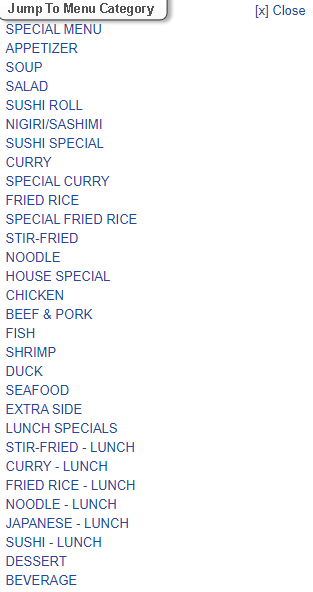
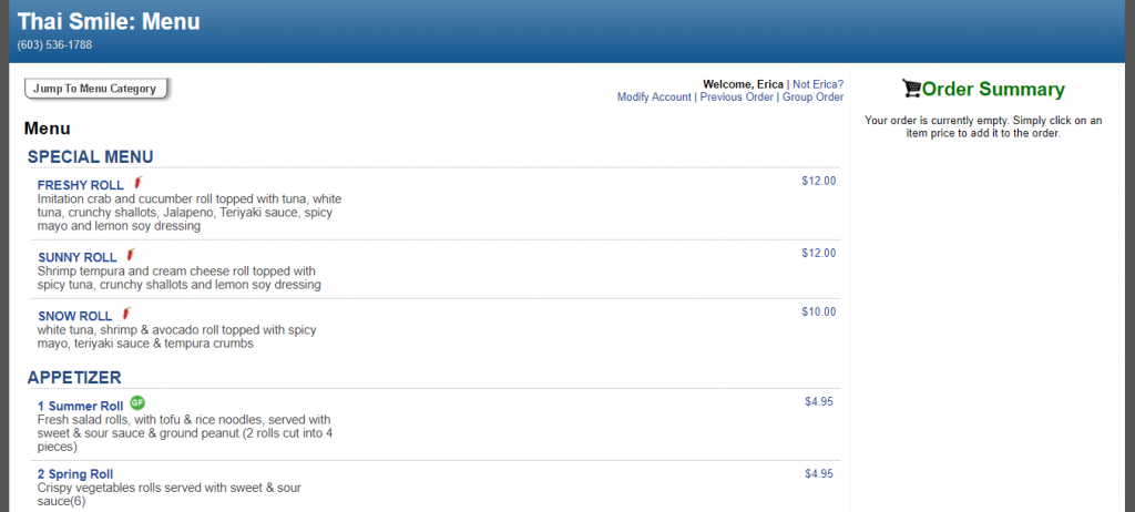
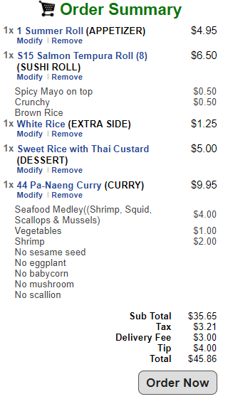
With that being said, the website IS easy to navigate, though. I found it was easy to find contact info, hours, and a fulfilling menu at the tip of my fingers. The menu features every dish, explained in plain text, BUT, is straight to the point. When adding dishes to the cart, the website makes it easy to modify those dishes (in this scenario, this includes quantity, and the ability to add/remove spicy mayo, brown rice, vegetables, hot sauce and at what intensity, types of protein, etc.) with no hassle. The menu also features a “Menu Category” navigation bar, making it as easy as ever to navigate to a different type of dish.
In order to test how well this menu works, I spent some time clicking on as many items to add to the cart as possible; adding/removing items; modifying orders; refreshing the page; logging out of my eCommerce account and back in; and basically, trying to break the website. (In the process of typing this out, I actually found out that from the Menu, you can’t go DIRECTLY back to Thai Smile’s website without retyping it in on your own — this is NOT good for usability!)
To test a website’s usability, I would recommend getting a collective group of people who are willing to spend time doing these same tasks listed above, and gaining their feedback to then improve on. By getting real-world testimonies of how people navigate the website, I would be able to see what/where the everyday person navigates to. To enhance the website even more, though, I would hire a Quality Assurance agent to test the website and make changes. I don’t believe there’s a right or wrong way necessarily to test usability of a website, as long as you’re able to learn something about accessibility in the process.
Thai Smile’s website was fun and easy to navigate. Testing the website from the “everyday college student” perspective, I had no quarrels and was able to easily place an order, even with specific modifications (I didn’t actually place an order today — lol). Just like any other website, there are changes to be made, but overall, Thai Smile has a strong and usable website.
See you for next week’s blog!